Chapter 6 Use Case
To test the evaluation framework, we use 5 visualization relating to climate change causes.
Before we begin looking at the data visualization. Let’s learn on what is climate and how is it changing? What are the effects of it and what causes these changes.
6.1 What is Climate?
Climate describes conditions over the long term and over an entire region. (“Climate,” n.d.)
6.2 Climate Change
Global climate is changing rapidly compared to the pace of natural variations in climate that have occurred throughout Earth’s history. Global average temperature has increased by about 1.8°F from 1901 to 2016, and observational evidence does not support any credible natural explanations for this amount of warming; instead, the evidence consistently points to human activities, especially emissions of greenhouse or heat-trapping gases, as the dominant cause.(Doherty S., n.d.)
6.3 Causes of Climate Change
Climate change can be caused by human activities and nature.
Here we take a look at 5 visualization that shows the causes of climate change.
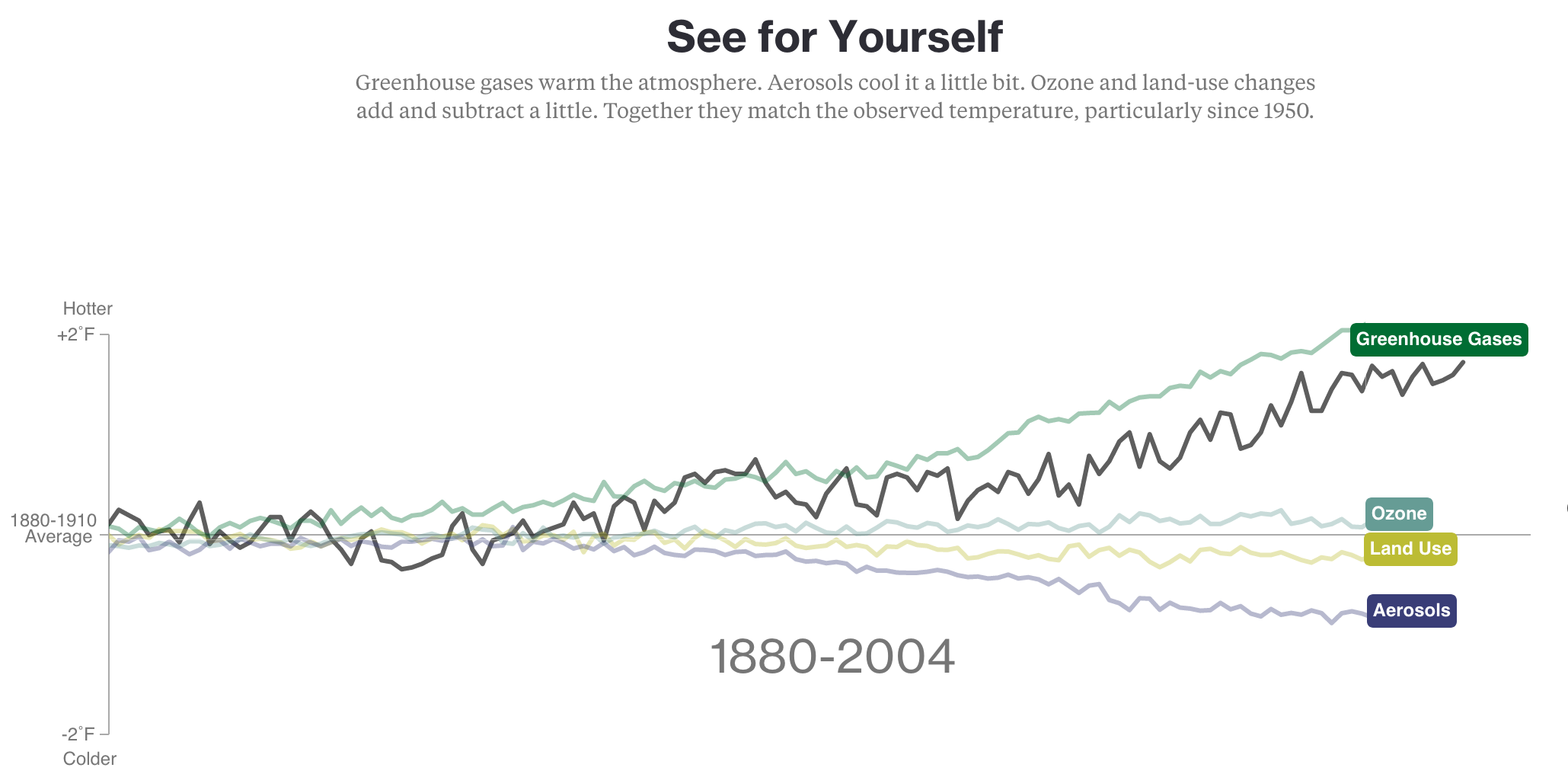
Figure 6.1: Source: https://www.bloomberg.com/graphics/2015-whats-warming-the-world/
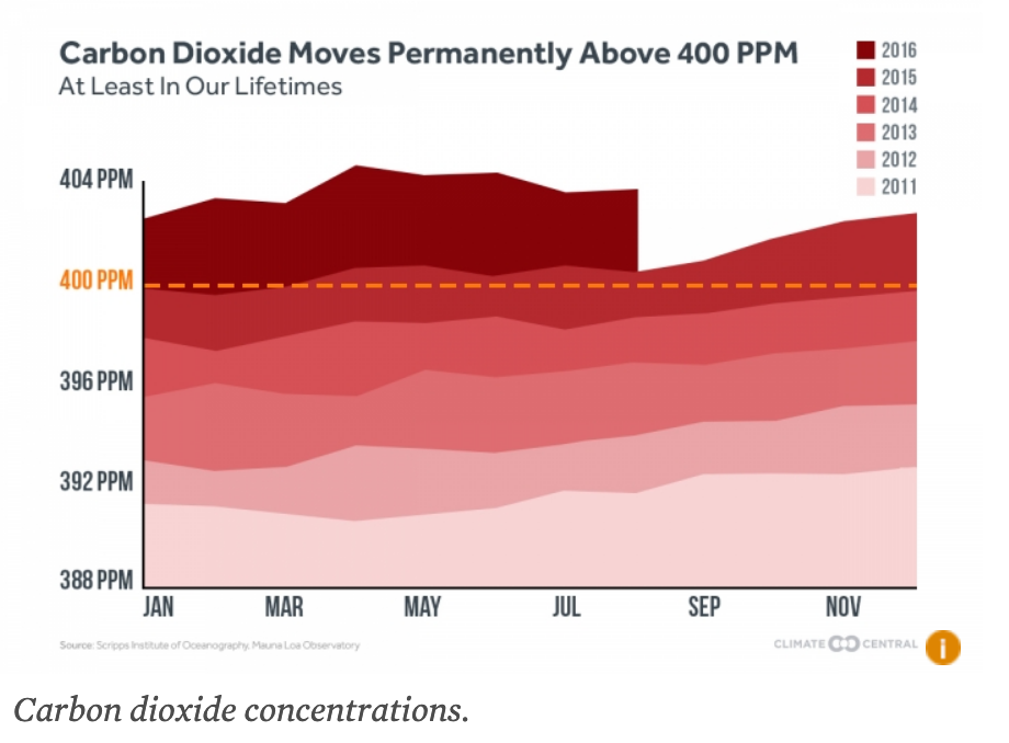
Figure 6.2: Source: https://www.ucsusa.org/global-warming/science-and-impacts/science/human-contribution-to-gw-faq.html
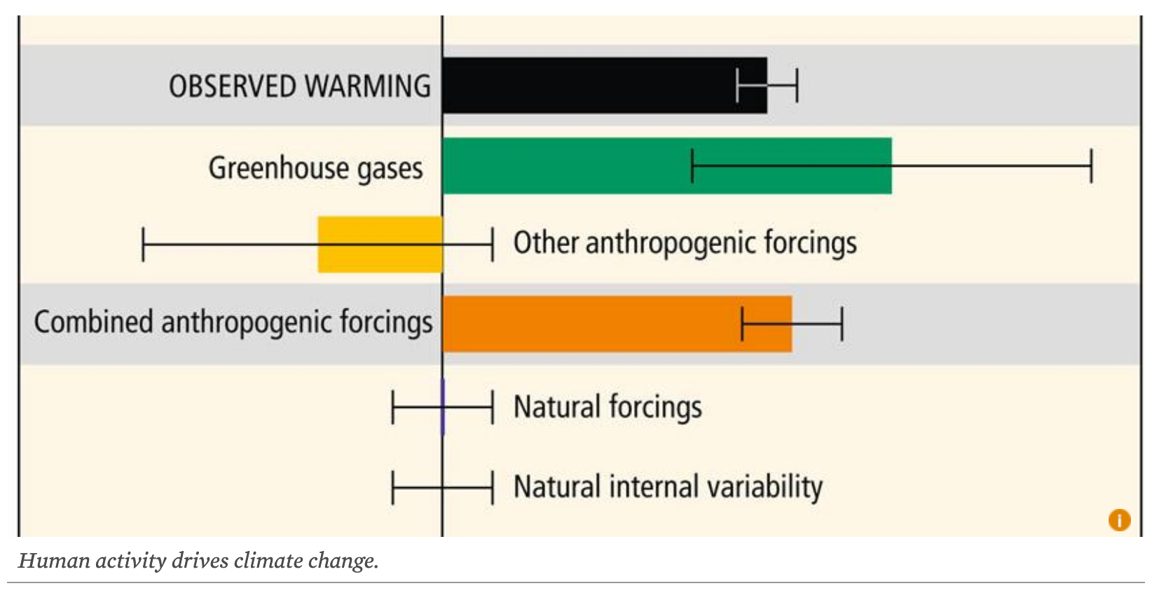
Figure 6.3: Source: https://www.ucsusa.org/global-warming/science-and-impacts/science/human-contribution-to-gw-faq.html
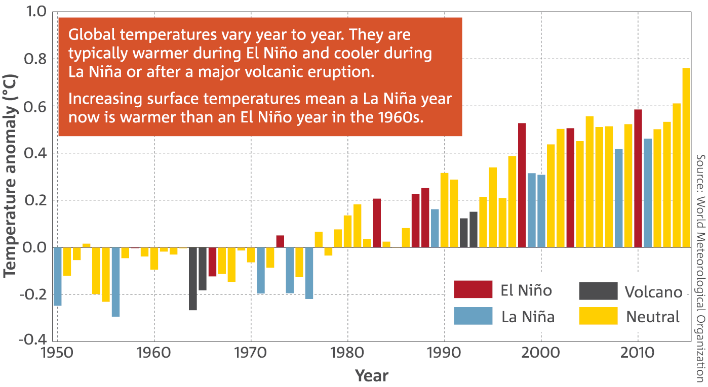
Figure 6.4: Source: http://www.bom.gov.au/state-of-the-climate/2016/
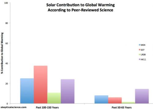
Figure 6.5: Source: https://www.skepticalscience.com/graphics.php?g=58
6.4 Evaluation Metrics
Using the evaluation framework described, we evaluate each of the visualization.
For each criteria listed, we give a point if the visualization meets the criteria
| Criteria | Visual 1 | Visual 2 | Visual 3 | Visual 4 | Visual 5 | |
|---|---|---|---|---|---|---|
| 1. | Suitable type of visualization used for the topic | 1 | 1 | 1 | 1 | 1 |
| 2. | Use of colors to draw attention | 1 | 1 | 1 | 1 | 1 |
| 3. | Use of colors/shapes/patterns to differentiate between elements | 1 | 1 | 1 | 1 | 1 |
| 4. | Labeled axis, with clear units | 1 | 1 | 0 | 1 | 1 |
| 5. | Title to indicate the topic | 1 | 1 | 1 | 1 | 1 |
| 6. | Proper use of white space between elements | 1 | 1 | 1 | 1 | 1 |
| 7. | Contains dataset covers duration sufficient to justify change in pattern (> 10 years) | 1 | 1 | 0 | 1 | 1 |
| 8. | Movement/Animation to draw attention | 1 | 0 | 0 | 0 | 0 |
| 9. | Describes the topic discussed | 1 | 1 | 1 | 1 | 1 |
| 10. | Integrity of data (data provided by valid sources) | 1 | 1 | 1 | 1 | 1 |
| 11. | Presents insights/prediction on the future/data | 0 | 0 | 1 | 0 | 1 |
| 12. | Clearness (quality) of visualization | 1 | 1 | 1 | 1 | 0 |
| Total Score | 11 | 10 | 9 | 10 | 10 |
6.5 Assessment
All five visualization agrees that earth’s climate is changing and the at the average temperature is increasing each year.
Visualization 1: Shows that greenhouses gasses emitted from human activities are the largest contributor to the increasing temperatures. While aerosol and land-use reduces the temperature. The line graph used is clear in presenting the information as it uses different colors and labels to identify each cause. While there are no ticks for years on the x-axis, it shows that the years observed ranges between 1880 - 2004 and a hover over the lines would show its exact year value for the point of hover.
Visualization 2: Shows the increase in carbon dioxide concentration in our atmosphere each year, causing the earth’s rise in temperature. The different hue of red from light to dark is used to emphasize increasing CO2 levels from fair to worst as each year passes.
Visualization 3: Shows the distribution of human activities comparing to natural forcings that contributed to climate change. From the boxplot, we can easily tell the outliers and distribution, however, it does not provide the numbers to show it’s impact.
Visualization 4: Shows that a change in temperature anomaly happened after 1975, where a La Nina year is now warmer than El Nino years in prior 1960. The bar chart uses different colors to indicate the different natural phenomenons distinctly.
Visualization 5: Shows the percentage contribution of solar variability to global warming for 2 time periods, the past 100-150 years (left) and the past 50-65 years (right), from various peer-reviewed studies. From the graph, it is apparent that solar activity percentage contribution has greatly reduced in the past 50-65 years, although the overall global warming is increasing - indicating that human activities contribituon have grown larger in proportionate and will likely to continue so in the next 50 years. Unfortunately, the image quality is poor for the visualization and hence, cannot capture the reader’s attention well. Moreover, if we compare the colors palette being used between visualization 4 and 5, we can see that visualization 4 does a better job at contrasting the different elements and increase overall appeal to the reader.